
.jpg)
The rise of self-publishing transformed the industry. As an author today, you have full control over your books, inside and out. With all the software and apps available, you can even create your own book cover. But should you?
It’s no wonder that, in your excitement to get your book out to the world, you may question the need for a professional cover artist. You think to yourself, how hard can it be? With a bit of technical experience, you can handle the job. But back away from your laptop for just a moment and let’s discuss.
As a serious writer, you’ve studied the craft and practiced newfound techniques, all in the quest to perfect your writing. You’ve written drafts, rewritten, edited, and proofread your manuscript. Maybe you even workshopped it in a writing group or hired a professional editor. Have you invested the same effort to master graphic design?
If not, you may be on your way to creating a cover that includes a couple of Googled images with a title pasted over them in a poorly chosen font with no appreciation of layout, design principles, or current industry trends. Your book deserves better than that. Its jacket should do justice to the effort and creativity contained within.
A book cover has a lot of work to do. It must catch the eye, engage the reader, but also depict the tone, genre, period, and setting of the story with the goal of selling the book to the appropriate reader. Moreover, it has to juggle all these demands while mainly existing as a tiny thumbnail in a sea of competitors. That’s a big ask for a single image and a couple of fonts. But it can be done. Just not necessarily by the writer of the book.
Be honest with yourself: Do you have the knowledge and expertise to pull this off? After all, a cover is the face of your book. It’s the first thing people will see, before they’ve even read the synopsis. Indeed, if that cover is unattractive or misleading to your intended audience, they may not get to the synopsis at all. And let’s not forget that each time someone shares a post about your new book on social media, the cover will be put before dozens, hundreds, maybe even thousands of discerning eyes and potential readers.
As a cover artist, designer and published anthologist, there’s something so pleasing about a well conceived, brilliantly executed book cover. Conversely, I find myself disheartened when I see the wasted opportunity for something special on a book that could be absolutely fantastic on the inside.
My father, Hugh Lamb, was a rather well known writer and anthologist of Victorian ghost stories (the anthologies I now publish started as my way of memorializing him after he passed away in 2019). I came to understand the publishing business from an early age. I remember his excitement with the publication of each book and with each new cover design that came for his approval.
I went on to attend art school and began designing and illustrating the covers for some of his books from the end of the 90s (with old-fashioned pen and ink rather than my now preferred Photoshop). I also illustrated books by other genre authors, including Ramsey Campbell. Unsurprisingly, I developed a love for the horror genre but I also learned the power of a good book cover.
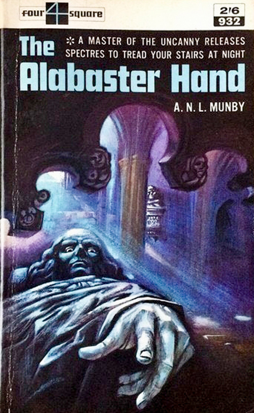
My father had a huge collection of books. One of my enduring childhood memories is creeping into my dad’s office with my brother to scare ourselves with some of the spookier covers in his collection. The ones I particularly remember are Tales of the Uncanny and Supernatural by Algernon Blackwood,

So my advice to you, dear author, as you embark on the wonderful experience of releasing your book into the wild, is make sure you hire someone to do the cover that it deserves if you are not experienced enough to do it yourself. But for those who decide that they will be doing their own cover after all, here are 5 basic pointers to help you out:
1. Design often works in trends. Look at the covers of other books in your genre. Don’t be afraid of putting your own spin on a layout you have seen and like (and that means a spin, not a direct copy).
2. Keep it simple. Composite images are not necessarily a bad thing (I use them myself), but if you don’t understand how to compose them, you may end up with a disjointed and distracting soup.
3. Check the ownership and licensing of the images you are using. Stock image sites can be ruthless when they discover you have used their property without purchasing the license.
4. Typefaces/fonts matter. They speak and have utility beyond being read. Make sure you pick a typeface for your title that suits the book’s genre and tone. Look at what other books in your genre use and select something similar. A flowery script typeface on the cover of a thriller (I’ve seen it) just doesn’t work.
5. Once you have put your elements together, look at the cover in thumbnail size. Does it catch your eye? Can you read it? Is it identifiable? If it does not work as a thumbnail, it is next to useless.
Good luck!
Richard Lamb
# # #
About the Author

No comments:
Post a Comment
Thank you for commenting